7.11.13

The Beautiful Meme Visit

Professional studio talk.


The Beautiful Meme came to give a talk about their practice, their creative process, and the work they have produced. I knew that they came to talk about copywriting predominantly, and it was interesting to hear about how they describe themselves as a creative agency, rather than graphic designers. They pride themselves on the variation between creative brains, and it's what they feel makes them a stronger agency compared to a group of graphic designers only.

They explained that copywriting is a skill in itself, and it should be separate to design, and so a copywriter should work with a designer and an art director because they will be a stronger team, as they all have those areas of focus, whereas someone that does a bit of everything may not be as strong.

They explained that copywriting is a process whereby a short prose should be edited down to all the necessary components, where the words are eye catching and memorable. They said that words should attract a viewer more than an image alone, because they make someone think more compared to an image. For a tea company they made the packaging for, they said that they would rather take a risk by using odd phrasing, and evocative words to attract a buyer rather than just having an image of someone picking tea leaves.


The work feels simplistic and straight to the point. The other projects they talked about were The National Ballet and The Battle of Bannockburn. Both of the projects use memorable copywriting to pull the viewer in. The Battle of Bannockburn uses image based typography as it's main logotype, and depicts imagery from the Scottish battle, along with the copywriting, whereas The English National Ballet uses photography and tag lines.


The overall sense that I got from The Beautiful Meme was that they would rather be 'revolutionary' than 'evolutionary'. They like to take risks, and aim to make statements through clever copy wiring than image alone.

5.10.13

Robot Food

Robot Food are on my radar for placement aspirations, or at least a studio visit. They are located in Leeds, and specialise in brand building and packaging. This is the type of agency or studio I aspire to work with.


I found this interesting 'inside the studio' article about them on The Dieline blog. I knew about Robot Food before I saw this article, however reading it made me want to visit them and work with them even more.

29.5.13

Presentation & Evaluation Of The Year

For my personal and professional practice presentation, I wanted the presentation itself to be image based, and to talk about everything myself.

• I started the presentation off with my identity designs, giving a hint to the my designs from the end of this year. This then rolls onto the beginning of the second year.

• The second year started off with such a long module, with print production and web forming the core to the first 5 months of the year. Along with the ISTD briefs these briefs felt very long and drawn out for me, and I didn't feel like a was fully warmed up from the summer to start designing great quality work. The print production module was definitely the more successful part of the 504 module. I produced a publication for the print production manual, using InDesign. This was a programme I didn't use at all in the first year, and so from the workshops we had at the start of the second year, I showed off the skills I had learnt through the print production manual. I bought an A3 printer towards the end of the first year, but to no avail could I get my printer to print a booklet from InDesign so in the end I had to create pdf's of the manual, and feed the stock through one at a time. To ensure everything lined up I made each page print from one side of the paper. I had to change the bind to a Japanese stab bind in order to make my design work with how it was printed so I left a longer edge on one side. Overall I am happy with my design for the print part of the module, and I can learn from my mistakes. I made some samples to go with the booklet which would showcase foiling and embossing techniques. I used an image of an offset litho machine as a motif running throughout the manual.

The image came from a printer visit, which allowed me to fully understand the print production process on a professional and mass scale. There was the height of technology with digital printers, to the traditional lithography printers. It was interesting to learn that litho is a dying method, with digital print taking over due to newer technology allowing for better quality prints. With the web module I have always struggled with maths or any methodical or mathematical methods, and so I found it really hard to code my website. I made it as simple as possible, and made it so the website still looked good even though it was made from possibly the most simple of grids. I don't have any desire to continue coding because I just find it illogical and I cannot work out how to solve problems when something needs to be done a different way. I want to continue working with web design though as this is a skill that can be used within branding and other design briefs. I have to say that I am just so ashamed of my ISTD brief I just want it to die and have never existed. I just couldn't think in a design way at that point in time and I wanted to just get on with the next module.

• Moving onto the responsive module, I felt really positive about approaching competition briefs and just giving things a go. The briefs I was most proud of were The Feel Good Drinks Co. brief, and the Secret 7" briefs. I chose to design labels for Feel Good, and although I initially found this brief quite hard in terms of thinking of concepts, in the end I went for a traditional approach, using the company logo and creating a colourful and fruity range of designs. I didn't win any briefs that I entered, however I am most proud of the Feel Good brief. I can see why some of the other designs were stronger than mine for the concept that they were driven by, and so this is something I carried onto the other briefs I completed. The secret 7" briefs were ones I thought I had a good chance of winning, however to no avail. I still feel that my still life vinyl cover is a really strong piece of design, and I think my peers were also surprised that I didn't win anything.

A really important aspect that I feel has improved the way I work is time management, and each time I approach a new brief I develop my skills in time management and ways of working. I use notebooks endlessly rather than creating design sheets, and I scribble down designs in pencil, usually until I get an idea of what I want to create. I can't force myself to do something I don't naturally do, and so I never hand in design sheets because they would be forced. I think a designer should work naturally, and working on a brief is a process unique to each individual. To do lists also get me through, they make me feel organised, and outline things I need to do without having the pressure of keeping them in my memory alone.

Moving onto the shorter and also successful briefs within the responsive module, I underpinned the Puffin books brief, and the Hellfire beer label with strong concepts. I set the time for completion of the beer label brief to one day, and I naturally completed the Puffin Books brief within a week. These shorter briefs proved to me that if I set my own time limit according to the brief then I can work to a professional time scale. I like that I had a strong use of typography, and that they are a new direction for me as a designer.

Overall I felt a mixture of content and disappointment with responsive, due to the fact that I didn't win a single thing, and I felt that some of my resolutions were really strong. Looking at my peers that won over me, and thinking that my designs were just as strong or even stronger made me feel really inadequate, and that I shouldn't be doing graphic design at all. On the other hand I have to remember that most of my peers have been doing graphic design for at least a year extra than I have, and that this is only my second year of doing it, along with the fact that I got a high 2:1 for the feedback, nearly gaining a first which is my strongest mark so far. I just need to remember that if I keep working hard I will eventually succeed. I will take this into the third year with me.

• With the What Is Good brief, I went into the research enjoyably because I chose something I wouldn't normally have chosen. I went with Thai Green Curry, and this led onto researching into Thai food in general. I was slightly confused as to what the tutors were looking for, and so I did plenty of research which would form the back bone for my design brief. I wrote the brief myself, and chose to design for product and packaging. This also had related subjects such as branding and identity, and promotional and retail. All areas that most interest at this stage in my graphic design journey. I felt that I used a wide range of production methods even though I DIY'd a lot of them. and I chose to design a variety of products too. I made my tote bags from scratch which I was proud of, however they were let down by the calico material not being able to take the transfer pen method, and so the stamping effect didn't really work. The web aspect of this brief was strong, and I am happy with the designs. I am overall really happy with this brief, and the research really comes through within the designs.

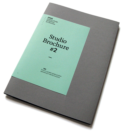
• For my self branding and identity design, I started by talking about my web presence, which is barely there at the moment. I really want to have a good portfolio that I am proud to show others, but at the moment I don't have that at all. I need to think about this kind of thing at the start of a brief, and also photograph my work so it looks good. There's no point in creating a body of work and not having good photographs of it. I have chosen to use a new web hosting site called Salon, and it is more versatile than Behance or Cargo, but it is harder to use, and it took me ages to figure out how to even get images where I wanted them! Salon gives me the opportunity to use my own domain name, and this is mostly why I chose to use it. This could change thought within the next few months.

My 'promo pack' and business cards coincide with eachother, and I chose to try and make my boring name interesting by using the four letters to highlight my four areas of interest within graphic design that hope become my speciality. I wanted my branding to be personal, and give potential employers a taste of me by reading my opinions and beliefs. Like quotes, they summarise my design philosophy. Colourful and playful, but showing off my design ability.

For the third year, I hope to start looking at gaining placement work, even thought this is a scary prospect, I hope that I will be fully ready next year to start emailing and making new contacts. I hope to develop my portfolio, and the way I work overall.

15.5.13

Visiting Professionals: Numiko

Numiko | visiting professionals talk.


The talk from Numiko was better than I expected. I have no intentions at this moment in time to design for screen, and so it was a comforting surprise to know that a designer doesn't necessarily need to know how to code the website, but just to know how to design for navigation, usability and general function.

The Numiko team work with another team of web developers, which makes a whole lot of sense seeing as that is their specialist area, and they concentrate on the design alone. Working with both code and design can be stressful, and one area needs to be thought about about before the other can take place, and so the designers work alongside the developers to establish the limitations and the possibilities of the design brief, without the two clashing. Numiko explained that this works well because it pushes both designers in their field of speciality and develops their skills as designers.

The kind of design they produce meets the clients needs, and is always underpinned by a strong concept.


3.5.13

What Is A Creative CV? Examples

Creative CV's.

What is a Creative CV?

Who are you writing it for?


Who needs to read it?

Who will actually read it?

What do they need to know?

What do they want to know?

When trying to search for creative CV's I found it pretty hard to find any good ones. These are the best ones I could find from searching for 'self branding' 'self promotion' and 'personal identity'. When I searched for CV's horrible designs would appear and so I didn't bother using that term again. I initially didn't think there was much point to the ambitious concepts, however I feel that there are too many generic designs out there, and so if I were to decide to design a produce a creative CV to send out to potential employers, then I would consider designing something that had a point of difference to the CV's that are currently out there. If it catches someones attention and makes them remember the design then that will function how I want it to.


This idea is fun, although I don't know whether I would trust the chocolate inside the CV enough to eat, because it was obviously wrapped in something else before the CV covered it.


This is pretty ambitious in my opinion, and although it is a 'message in a bottle' it doesn't necessarily convey the instant image of someones CV. It looks like a medical sample rather than a creative CV.


I do like this layout and the simplicity of it, and the overall subtly of it, however this may not excite the intended audience.


11.4.13

Samples Of Work: The Foreign Policy

The Foreign Policy

I'm in two minds as to whether I actually like this or not, however the name has influenced the design and it does communicate the concept well. It is easy to understand, and plays on a fun concept.


6.4.13

Samples Of Work: Jason Booth

Jason Booth

Graduate show invite.

I struggled to find loads of these samples of work, but this one stood out to me as a simplistic design that functions well. It is not a business card but an invitation to a graduate show, and as it is small enough to fit into a wallet, it is more likely to be kept and not thrown away.


4.4.13

Visiting Professionals: The Democratic Lecture

The Democratic Lecture, by Crag Oldham.


It started off with a lot of swearing, and it finished with even more. Craig came in and delivered a really interesting, and brutally honest talk about his own experience within the graphic design industry, and he passed on some useful information for design etiquette and general do's and don'ts. I was a bit skeptical about this talk, and I thought it might be more of a niche taste, going off the titles of the lectures.

The lecture about 'the importance of tea' went onto the subject of placements, how to act politely when on one, and how to approach getting one. He explained that you may end up being a very good assistant in tea making and handing biscuits around, but on the other hand it may lead you to learn a great deal, and be beneficial to personal development.

His own experience breeds from the confidence he has in himself, and when presenting work it should be good quality, and for example if you can't photograph work well, mock it up in photoshop. He showed his own work from his degree, and explained that he mocked his up due to him lacking skills in photography of work. He went onto his own personal likes and dislikes, and when presenting work certain ways of placing printed pieces annoy him, and so it made me think about how presenting work could potentially make or break getting a placement or a job. This is something I consider now. A portfolio should be a relatively small selection of best work, and along with a strong portfolio, an upbeat and excited attitude always gets attention over someone that isn't interesting or personable.

There are a lot of things that Craig brought up within the lecture that made me think about how I need to present myself, and I think I now have the knowledge for when I will be ready to start contacting professionals for a placement. Im not quite ready yet, but the lecture gave me some vital pointers for when I might be, and when I get there I'll know how to make a brew. (As if I can't make one already!) I came away from the lecture feeling like I was let in on some secrets about the industry I want to work in, and I feel better off from going to it.

On another note, the overall luminous branding and identity for The Democratic Lecture works well with the subject. I don't particularly like the typeface used for the titles, but it still works with the bright colour, and publication design. The open bind is lovely, and crafting shown openly shows off the printers skill in their craft as well. this shows a nice unison between craftsmanship and design.

Wish I bought the book when I was there now.


3.4.13

Samples Of Work: Studio EMMI

Studio EMMI

Printed on environmentally friendly paper with vegetable ink.

EMMI have designed a publication that showcases their work. It has a point of difference in it's eco credentials. It has been nicely designed however it doesn't excite me.


2.4.13

Samples Of Work: K.P.D.O.

K.P.D.O. is an identity designed for Kerry Phelan Design Office, a newly-formed, interior design studio in Melbourne.

This is not a designer promoting themselves, however it is a great example of how a designer has created promotional material for someone else, and this same format could be used as a designers personal promotional project. Im not sure if that envelopes have a function and whether they post the business cards in them but they are so appealing to me, even though the entire branding is so simple. Design does not necessarily need to be complicated.


30.3.13

Samples Of Work: Six

Six

08/09 limited edition promotional mailer.

A simple mail shot has been used he to promote and celebrate Six's work, and could gain them potential new clients. It is a simple concept and format, however the stock and design has been well considered and looks good quality.


Samples Of Work: GF Smith

GF Smith

Master Specifier 201.

This paper sample pack is certainly the nicest I have seen. I managed to have a look at one close up, and as a set of objects they have been crafted beautifully. The sample pack is something that every paper company needs to have, however GF Smith go all out on the design of the entire company, and this also acts as promotional material. First impressions count, and when paper samples are packaged as nicely as this, it functions to it's purpose where designers will appreciate something that is well designed.


Samples Of Work: Ro & Co Studio

Ro & Co Studio

Ro & Co Cordials.

This studio designed and made this cordial set for it's own clients as a thank you gift, and this in turn promotes them as a studio. It creates interactivity and is a memorable project because it is fun and different.


19.3.13

What Do They Do?

Freelance graphic designer
Amanda Jane Jones

I have looked at a freelance designer because that it something I want to become in the next 10 years. This is something that I could work towards whilst working for a graphic design agency. I have looked at Amanda Jane Jones because I feel her work has synergy to how I am currently working, and her work also corresponds to my kind of taste level. Another female working as a freelance graphic designer is encouraging too, and I do believe that females and males work in slightly different ways, although the audience does not necessarily dictate how the gender of the designer reacts to a brief. All designers are competing against eachother however freelance designers usually need to build on a portfolio where word of mouth and networking are essential for keeping clients and gaining new ones. I feel that I could design and create a better looking website that functions in an easy to understand way in comparison to hers. Her layout it a grid, with fixed size boxes containing snapshots of her work.


Her experience and about section:

Amanda Jane Jones
freelance graphic designer and letterpress artist
Ann Arbor, Michigan

Feel free to e-mail her at:
amandajane@kinfolkmag.com

You can also say hello on twitter!

Strengths - This particular designer has made lots of connections within the general art and design world, and is a blogger on the side of her freelance career, and so this has contributed to her success and exposure to potential clients. She always uses her full name, that happens to have a nice ring to it, and this is a kind of signature that works for her. It's a feminine identity and sets her apart from other designers that are female and may only be using two of their names or using a name that isn't their own at all.

Weaknesses - Her website is hosted by Cargo Collective and so it is not her own domain, and this kind of website has been associated with portfolio sites looking and feeling semi professional. I have the overall feeling that having my own domain name and website would make me and my work look more professional, even though I am post graduate still. There isn't too much personality in the layout and design of the template she has used on Cargo, whereas if she had made her own template or customised it a bit more this would have made her work stand out more and inject some personality into the site.

Opportunities - There isn't many opportunities to collaborate with another freelance designer although that would be the only way to work with this designer. There wouldn't be any point of an intern working for a freelance designer for obvious reasons.

Threats - She is older than I am however If I were to become a freelance designer, there are some similarities in that we are both females, and her work has synergy with mine.

Small graphic design agency

Robot Food

This company is one that I am aiming to work for after I graduate, and so I want to make sure my work constantly has synergy with theirs. They specialise in the food and drink packaging and branding sector, which is the area I have stated I want to concentrate on and work towards working for. They are based in Leeds, just outside the city and they describe themselves as a 'brand building agency'.


"Robot Food is a results driven, innovative brand-building agency – born by the ambition and obsession of an independent creative collective. Spurred by big agency experiences, we stray from the well-worn path, to offer a more hands-on approach and a service second to none. As an intimate team with a wealth of creative intelligence, we fine tune brands from the inside out, telling believable brand stories… and our attention to detail is remarkable."


Strengths - They have made the effort to come across as a small and personable agency, and they have also made themselves appear that way, avoiding the corporate aesthetic. They have concentrated on working for a particular sector, the food and drink business. Whether it be branding collateral and web, or just packaging they have a niche appeal. This will set them apart from other agencies of the same size that work for a wider range of sectors.

Weaknesses - The information on their website could be layed out so in the categories of the type of work they have done so the potential client knows exactly what they can do without having to make vague guesses by just looking at their projects. Categorising the branding, packaging, print and other aspects of their work would make their company easier to understand. The name of the company makes them sound immature too, and although Robot Food would relate directly to the sector they target, it still sounds unprofessional to a certain extent, however that may be down to personal opinion.

Opportunities - I would like to approach them for a studio visit and hopefully an internship, and this would be the opportunity window for me to work with them. This could have a draw back and damage my chances of employment with them post graduation if they don't like me.

Threats - The threats to this company are other UK based independent studio's or agencies that work for the same food and drink sector. B&B are a very similar company however they aren't based in the UK, and Here Design Studio are based in London and are a slightly more up market version of Robot food, and the type of company Robot Food perhaps aspire to be like.

Large graphic design company

Elmwood


About:

Put simply, we help brands uncover what’s special and different about themselves and tell the world about it. There’s the thinking and words in brand strategy and brand language through to the visual magic of corporate design and packaging design. Our digital work brings all this together.

Strengths - Elmwood are huge, and have offices based internationally. This means that they have established many contacts over the years and they have worked hard as a company to achieve the status of being an internationally renowned 'brand design consultancy'. They have a huge client base and have a reputation to live up to. They started in Leeds and grew to huge proportions and so this is something that they can brag about.

Weaknesses - Many companies are evermore working with the smaller independent studios or agencies, because they feel they can bring something personal and non-corporate. A corporate feel is something that a large graphic design consultancy risks. The kind of clientele that Elmwood work with are often large corporations. ASDA for example are one of them, however many people may not know that ASDA has it's headquarters based in Leeds, the starting place of Elmwood, and so this means both companies can work closely geographically together.


Opportunities - I know that students have worked for Elmwood as part of work experience, which makes a lot of sense as they probably have the resources and enough staff to work with students or post graduates. As a large company I would expect that they would have enough work to keep any number of students occupied for a week or two. Something that a smaller agency or company would perhaps not be able to offer.

Threats - Other large graphic design companies are in direct competition with Elmwood, however I think more smaller studios or agencies are almost in equal competition because often they offer a point of difference to the corporate aesthetic that larger companies often offer.

Who Am I? Who Are They?

What are my professional/creative aims and how do they relate to the needs of the client group?

The aims I am developing over the course of this degree have evermore lent towards the need and supply of retail for graphic products. The types of graphic product I am most interested in designing so far throughout my development is packaging graphics for food and drink. This is the key area that I plan to focus on and further. The collateral that relates to food and drink packaging could be placed within the sector of food and drink retail, and the restaurant and cafe business. The tertiary sectors to food and drink retail could include specialist stores selling a limited range of products, along with other retailers such as cosmetics, book, music and clothing.

Point of sale is an area I am increasingly interested in. There is scope for a a wide range of graphic products to be created for this kind of area, along with art direction, and an interactive aspect. Every retail store has various kinds of point of sale or promotional material and so this is an essential component for the company to make sales, along with the overall branding, identity and most important of all, the product itself.

Graphic products I also enjoy designing for, or would like to design for are menu's, bags, business cards, wrapping, covers, wall or window decals, wayfinding and signage, leaflets and graphics for uniforms. The overall branding and identity of a company will need these key components to convey themselves as a company and to find a point of difference to it's competitors.

Web and interactive aspects are important for any company too, and I would like to think that I have the ability to transfer my skills across to this type of practice. Although I do not have aims for this to be my speciality I have enthusiasm for it and I would like to design an interface for a web developer to code as part of a collaboration practice. There are pieces of knowledge about how web design works when I am not coding the website, for example how it would function, and so the design has to fit into how the web developer works to an extent, and so I aim to develop this skill over the rest of the second year and the third year.

Branding is something I am always looking at online, and the kind of brief that stands out to me is the kind that is driven by a strong concept. The projects I am always attracted to are restaurant/cafe or food retail branding. Here are some examples of what I would consider successful branding.


17.3.13

Who Am I? Who Are They?

What skills would I need to work for the sectors and what skills would I need to develop?

For working for the retail sector the skills I would need to develop include scale and proportion, how things would look in a store, so creating prototypes and going to the stores and experiencing the environment in which my designs would function in. Target market research is also an important factor when designing graphic products that consumers would be buying and taking home and using. This influences the design along with the brief, and what the client wants. This should reflect the company ethos and they will also specify the type of clientele they have and suggest how I should target them. Packaging design has a 3 dimensional aspect and so prototypes and making my own mock ups before print is essential. Legibility, and simplicity along with getting the correct information are the components for making successful packaging designs, and this is something I am working on as soon as I get the opportunity and when I can adapt a brief so that I can design for the sector I want to work for. The branding and keeping in with a companies current aesthetic is essential in order to design collateral that work together, and so this is another skill that I will need to practice with and work on. I really enjoy looking at branding projects, and seeing the diversity of products and the innovative techniques that production and finishing can bring out in printed products. A strong concept is another aspect to look out for and this holds a project together. My favourite branding projects have been for coffee brands, cafe's and restaurants and food products or food stores. I want to carry on finding projects and briefs that I can progress these skills on with.

14.3.13

Who Am I? Who Are They?

Services that relate to my personal interests and skills.

From looking at my personal and skills, the services that most relate to these are;

• Food retailers

Food retailers need services in graphic design where it relates to food packaging, business cards or other promotional material, bags, wrapping, logo, identity, point of sale, website, apps.

Within food packaging, the product is the most important aspect and so the packaging would need to reflect this. How the products are promoted

• Retailers for clothing, books and music or cosmetics

For retail, the kind of graphic products that could be produced include point of sale printed material such as large scale product suggestions, advertising a new product or wayfinding. Product placement and art direction could also fit into this category. Bag design, logo and identity design, packaging for product, leaflet or other promotional material, website and apps including point of sale on the website itself.

• Restaurants/cafe's

A slightly different sector where menu design and other collateral such as crockery and cutlery could even become graphic products. For the eatery sector this is where food is distributed to the customer to eat there and then as opposed to food retail where the food is bought there and then taken home to consume and so wayfinding and signage need to come into play where eatery's are concerned. Menu design can be taken to different scales, and so wall menu and smaller paper based handheld menu need to correspond to eachother. Logo and identity design, uniform graphics, promotional material, loyalty cards, website and apps.

There are many avenues within the retail sector, however I have learnt that they all need to come together to create a one working unit, and so a developed concept needs to hold these components together.

Who Am I? Who Are They?

A list of all possible client groups that use graphic design in he development, production, distribution, promotion and/or communication of their products or services.

• Museums
• Visitor centres
• Local councils
• The government
• Private corporations
• Financial services
• Software companies
• Supermarkets
• Small businesses
• Independent retail outlets
• Architects
• Charities
• Restaurants
• Education
• Colleges
• Schools
• Printers
• Internet companies
• Self employed people
• Estate agents
• Shopping centres
• Cafe's
• Clothing retailers
• Outdoor retailers
• Cosmetics retailers
• Book, music and film retailers
• Hairdressers
• Butchers
• Alcohol stores
• General stores
• Newspaper printers
• Magazine printers
• Magazine editors
• Newspaper editors
• Coffee companies
• Confectionery companies
• Haulage and freight services
• Airline companies
• Train companies
• Television channels
• Social networking sites
• Personal trainers
• Photographers

10.2.13

Why Am I Here What Do I Want To Learn?

Layout and editorial

This is an area I haven't yet concentrated on, but really appeals to me. It feel like proper graphic design to me, even though it isn't! I like the idea of having the constraint of the format, but allowing for creativity within that. It is almost easier to be more creative when there is constraints because then I know what the limits are. A lot of information needs to be dealt with often when designing for editorial and layout and so placing this information is the challenge. I like seeing layouts where the text feels like it sits in just the right places, and functions for the needs of the reader.